SHANYIN'S SPACE
Blog | Notebooks | Sharing | Everything
Matplotlib
Learning notes of Matplotlib by Morvan Zhou
Install
In Windows:
python -V 	# Check python version (Or `python3 -V`)
python -m pip install --upgrade pip	# Upgrade pip
python -m pip install numpy	# Install numpy first
python -m pip install matplotlib
Basic
Basic Commands
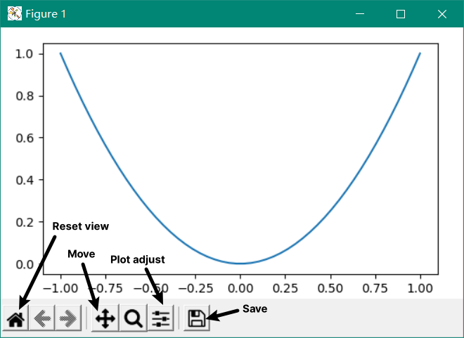
plt.plot(x, y): Plot the functionyofxplt.scatter(): Plot scattered linesplt.show(): Show the figure
import matplotlib.pyplot as plt	# Import matplotlib but only .pyplot part is useful
import numpy as np

x = np.linspace(-1, 1, 50) # Generate 50 points from -1 to 1
# y = 2 * x + 1
y = x ** 2	# Try another function

plt.plot(x, y)  # plot
plt.show()  # show figure
Result:
Figures
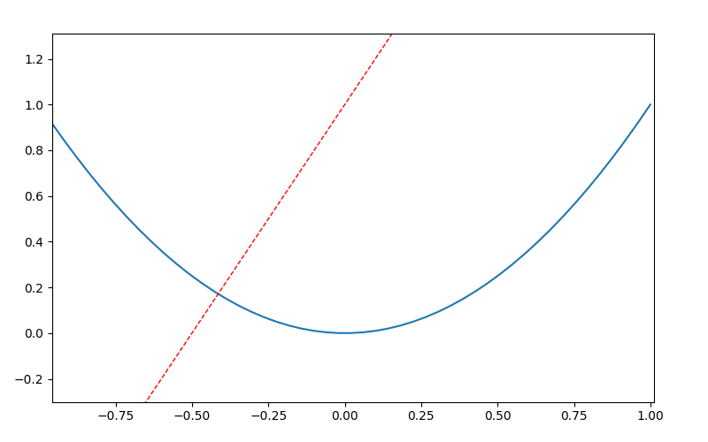
When we want to make y1 = 2 * x + 1 and y2 = x ** 2 in 2 figures:
plt.figure()	# when making multiple figures, use this command before very `plt.plot()`
	# (if not spec., number will show in order)
plt.plot(x, y1)  # plot the first figure

plt.figure(num = 3, figsize = (8, 5))	# specifiy as 'figure 3' and a figure size 8x5
plt.plot(x, y2)	# plot the second figure
plt.plot(x, y1, color = 'red', linewidth = 1.0, linestyle = '--')	# plot another line with specific color, line width and dashed style in 'Figure 3'

plt.show()
Result: 2 windows with ‘Figure 1’ and ‘Figure 3’ (Figure 3 shown below)
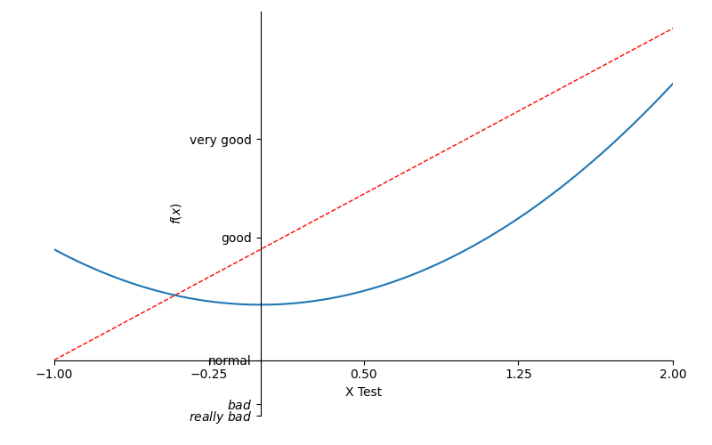
Coordinate
-
Axis range:
plt.xlim((x1, x2)) -
Axis label (title):
plt.xlabel('Some title text') -
Ticks step:
new_ticks = np.linspace(-1, 2, 5)+plt.xticks(new_ticks)(From -1 to 2 and 5 ticks totally, which means every step is 0.75) -
Tick texts: (use
$$to apply LaTeX math format (\to show blank space) and userto apply raw string)plt.yticks([-2,-1.8, -1, 1.22, 3], [r'$really\ bad$', '$bad$', r'normal', 'good', 'very good']) -
Set Frame:
#gca = 'get current axis'
ax = plt.gca()
ax.spines['right'].set_color('none')
ax.spines['top'].set_color('none')	# top and right frames disappear
ax.xaxis.set_ticks_position('bottom')	# set bottom frame as x-axis
ax.yaxis.set_ticks_position("left")
ax.spines['bottom'].set_position(('data', -1))	# set x-axis at y = -1
ax.spines['left'].set_position(('data', 0))	# if x and y axes are all set to 0, so that get original pt
also
axescan be used to represent the percentage of axis.
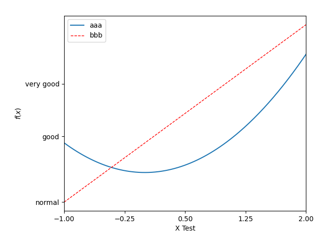
Legend
- Label a line:
label = 'Name of the line' - Show the label:
plt.legend()- Handle: Must have added objects of the plotted lines (
l1, =/… ), end with,and reference inhandles=[l1, ...]- Labels:
labels=['xxx', ...]Prior than the label atplt.plot(..., label = '')
- Labels:
- Legend location:
loc='upper right'/'lower left'/..., usually useloc=best
- Handle: Must have added objects of the plotted lines (
l1, = plt.plot(x, y2, label = 'up')
l2, = plt.plot(x, y1, color = 'red', linewidth = 1.0, linestyle = '--')
plt.legend(handles=[l1, l2,], labels=['aaa', 'bbb'], loc='best')
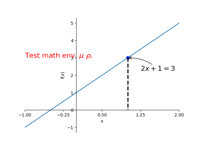
Annotation
-
Method 1:
plt.annotate(r'$2x+1=%s$' % y0, xy = (x0, y0), xycoords = 'data', xytext=(+30, -30), textcoords = 'offset points', fontsize = 15, arrowprops = dict(arrowstyle='->', connectionstyle = 'arc3, rad=.2'))-
Main text to show:
r '$2x+1= %s$' % y0,y0’s value will substitute into the%spart -
Main point:
xy = (x0, y0) -
Text offset to the point:
xytext = (a, b),aandbhere means the offset on the x and y axistextcoords = 'offset points'to apply this text with the spec. offset to the point -
Arrow:
arrowprops = dict(arrowstyle='->', connectionstyle = 'arc3, rad=.2')
-
-
Method 2: Text
plt.text(-1, 3, r'Test math env. $\mu\ \rho_i$', fontdict={'size':16, 'color':'r'})- Starting location: the first 2 parameters
(-1, 3) - Font setup:
fontdict={}: parameters:'size': n&'color': 'xx'
- Starting location: the first 2 parameters
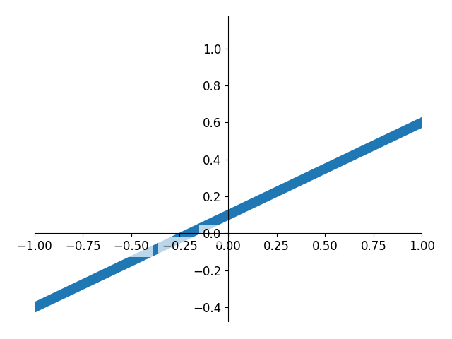
Tick Setting
Add background color with some transparency for ticks on the axis
# In windows zorder should be added
plt.plot(x, y, ..., zorder = 1)

for label in ax.get_xticklabels() + ax.get_yticklables():
    label.set_fontsize(12)
    label.set_bbox(dict(facecolor='white', edgecolor='None', alpha=0.7))	# alpha can also be used in plot (70% transparency)
Graph Types
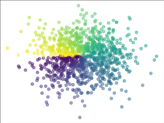
Scatter
-
Main Command:
plt.scatter(x, y, ...)- Details:
s = xx(size);c = T(color ->cmapcolor map using our generated T);alpha = 0.x(transparency)
- Details:
-
Scatter line:
plt.scatter(np.arange(5), np.arange(5))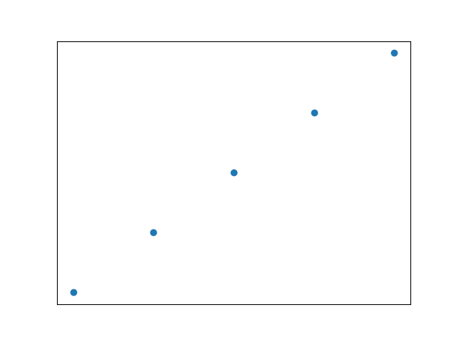
import matplotlib.pyplot as plt
import numpy as np

n = 1024
X = np.random.normal(0, 1, n)
Y = np.random.normal(0, 1, n)
T = np.artan2(Y, X) # for color value

plt.scatter(X, Y, s = 75, c = T, alpha = 0.5)
# plt.scatter(np.arange(5), np.arange(5))

plt.xlim = ((-1.5,1.5))
plt.ylim = ((-1.5,1.5))
plt.xticks(())	# hide all ticks
plt.yticks(())

plt.show()
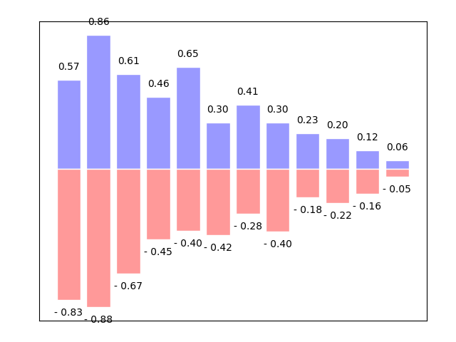
Bar
- Main Command:
plt.bar(x, y, ...)- Details:
facecolor = '#9999ff'(Main color);edgecolor = 'white'
- Details:
n = 12  # 12 bars (actually 12 up and 12 down for demo)
X = np.arange(n)
Y1 = (1-X/float(n)) * np.random.uniform(0.5, 1.0, n)    # Generate values from 0.5-1 for every n (12)
Y2 = (1-X/float(n)) * np.random.uniform(0.5, 1.0, n)

plt.bar(X, +Y1, facecolor = '#9999ff', edgecolor = 'white')
plt.bar(X, -Y2, facecolor = '#ff9999', edgecolor = 'white')

# Add texts
for x, y in zip(X, Y1): # zip for looping x->X, y->Y1 dividedly in every step
    plt.text(x, y+0.05, '%.2f' % y, ha = 'center', va = 'bottom')
    ## %.2f means 2 significant digits; ha = horizontal alignment

for x, y in zip(X, Y2):
    plt.text(x, -y-0.05, '- %.2f' % y, ha = 'center', va = 'top')
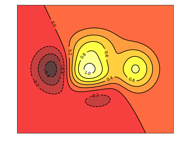
Contours
-
Fill color:
plt.contourf(x, y, ...)- Details:
f(x,y)(a def. func. for the level);n(how many colors (0 for 2 colors, 8 for 10 colors));alpha =(transparency);cmap=plt.cm.hot(color map, can also choose other cmaps)
- Details:
-
Main command:
C = plt.contour(x, y, ...)- Details:
f(x, y);m(how many lines);colors = xxx;linewidth = .5
- Details:
-
Label:
plt.clabel(C, inline=True, fontsize=10) If
inline = False: The numbers will overlap on the lines
def f(x, y):
    # define the height function
    return (1 - x/2 + x**5 + y**3) * np.exp(-x**2 - y**2)

n = 256 # (res.)
x = np.linspace(-3, 3, n)   # from -3 to 3 with 256 pt.s
y = np.linspace(-3, 3, n)   # x-y is a square
X, Y = np.meshgrid(x, y)    # Create mesh (binding with x and y)

# Fill: Use plt.contourf to filling contours
# X, Y and value for (X, Y) point (Use cmap which is hot color)
plt.contourf(X, Y, f(X, Y), 8, alpha=0.75, cmap=plt.cm.hot) # The def. f(x,y) with meshed X and Y

# LINES: Use plt.contour to add contour lines
C = plt.contour(X, Y, f(X, Y), 8, colors = 'black', linewidth = 0.3)

# LABELS
plt.clabel(C, inline=True, fontsize=10)
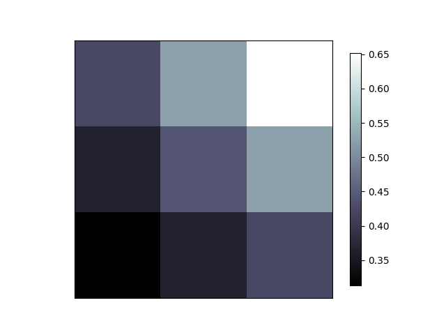
Image
-
Main command:
plt.imshow(a, interpolation='nearest', cmap='bone', origin='lower')(
a: data set (color pixels);origin=decides the original point of the array)Interpolation: Webpage
-
Colorbar:
plt.colorbar(shrink=0.9)(Size of the colorbar is 90% of the image)
# img data (generate a fake img)
a = np.array([0.313660827978, 0.365348418405, 0.423733120134,
              0.365348418405, 0.439599930621, 0.525083754405,
              0.423733120134, 0.525083754405, 0.651536351379]).reshape(3,3)  # 3x3 colors

plt.imshow(a, interpolation='nearest', cmap='bone', origin='lower')
plt.colorbar(shrink=0.9)
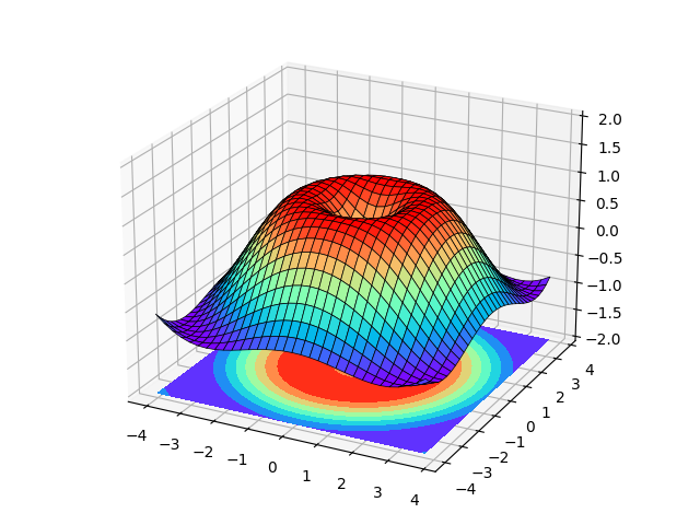
3D Plot
- Lib.:
from mpl_toolkits.mplot3d import Axes3D - Create 3D coordinates:
ax = Axes3D(fig)(fig = plt.figure()) - Plot:
ax.plot_surface(X, Y, Z, rstride = 1, cstride = 1, cmap =plt.get_cmap('rainbow'))rstride&cstride: row and column step size (sparse when higher values)
- Colorfill:
ax.contourf(X, Y, Z, zdir = 'z', offset = -2, cmap = 'rainbow')(projection onzdir) - Set range:
ax.set_zlim(a, b)
import matplotlib.pyplot as plt
import numpy as np
from mpl_toolkits.mplot3d import Axes3D

fig = plt.figure()
ax = Axes3D(fig)
# X, Y value
X = np.arange(-4, 4, 0.25)
Y = np.arange(-4, 4, 0.25)
X, Y = np.meshgrid(X, Y)
R = np.sqrt(X ** 2 + Y ** 2)
# height value
Z = np.sin(R)

ax.plot_surface(X, Y, Z, rstride = 1, cstride = 1, cmap =plt.get_cmap('rainbow'), edgecolor = 'black', linewidth = .5)
ax.set_zlim(-2, 2)
ax.contourf(X, Y, Z, zdir = 'z', offset = -2, cmap = 'rainbow')

plt.show()
Subplot
Subplot Multiple
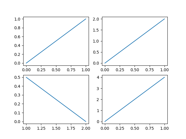
- Main Command:
plt.subplot(a, b, n)(a rows, b col., nth position) (thenplt.plot(...))
plt.figure()
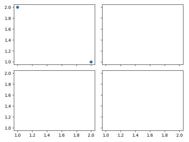
plt.subplot(2, 2, 1) # 2 rows, 2 col. This is the 1st plot
plt.plot([0,1], [0,1])
plt.subplot(2, 2, 2) # 2 rows, 2 col. This is the 2nd plot
plt.plot([0,1], [0,2])
plt.subplot(2, 2, 3) # 2 rows, 2 col. This is the 3rd plot
plt.plot([2,1], [0,0.5]) # (2,0) - (1,0.05)
plt.subplot(224) # 2 rows, 2 col. This is the 4th plot
plt.plot([0,1], [0,4])
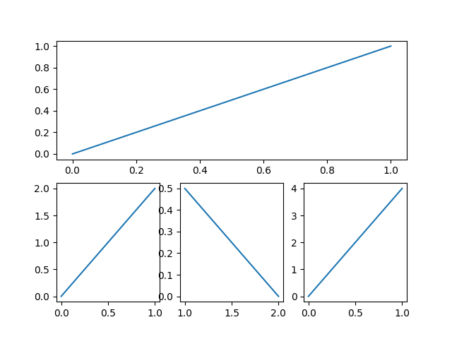
plt.subplot(2, 1, 1)    # 2nd method
plt.plot([0,1], [0,1])

plt.subplot(2, 3, 4)    # 2nd row, but with 3 columns (actually at 4th position)
plt.plot([0,1], [0,2])

plt.subplot(2, 3, 5)
plt.plot([2,1], [0,0.5])    # (2,0) - (1,0.05)

plt.subplot(2, 3, 6)
plt.plot([0,1], [0,4])
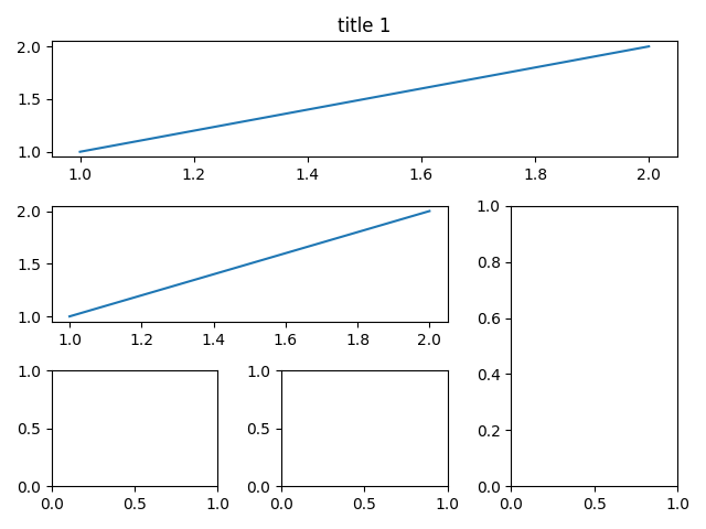
Subplot in Grids
plt.tight_layout()should be added beforeplt.show()
Method 1
-
ax1 = plt.subplot2grid((a, b), (o1, o2), colspan = 3, rowspan = 1)for the first plot(arowsbcolumns; the first figure originated at(o1, o2),colspan: col. width)
import matplotlib.pyplot as plt
import matplotlib.gridspec as gridspec

# Method 1
##########

plt.figure()
# plot 1
ax1 = plt.subplot2grid((3,3), (0,0), colspan = 3, rowspan = 1) # 3 row 3 col.
ax1.plot([1,2], [1,2])
# ax1.set_xlabel = plt.xlabel; ax1.set_title = plt.title; ...
ax1.set_title('title 1')
# plot 2
ax2 = plt.subplot2grid((3,3), (1,0), colspan = 2)
ax2.plot([1,2], [1,2])
# plot others
ax3 = plt.subplot2grid((3,3), (1,2), rowspan = 2)
ax4 = plt.subplot2grid((3,3), (2,0))
ax5 = plt.subplot2grid((3,3), (2,1))

plt.tight_layout()
plt.show()
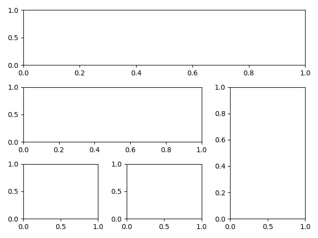
Method 2
- Lib.:
import matplotlib.gridspec as gridspec - Define grids:
gs = gridspec.GridSpec(n, m)(n x m grid) - Define every plot:
ax1 = plt.subplot(gs[r, c])(r - row; c - col.)
# Method 2
##########

plt.figure()
gs = gridspec.GridSpec(3,3) # 3x3 grid
ax1 = plt.subplot(gs[0, :]) # 0th row and occupies all columns
ax2 = plt.subplot(gs[1, :2])    # 1st row and take place of first 2 col.
ax3 = plt.subplot(gs[1:, 2])
ax4 = plt.subplot(gs[-1, 0])    # last row and 1st col.
ax5 = plt.subplot(gs[-1, -2])   # last row and last second column
Method 3
-
Main Commands:
f, ((ax11, ax12), (ax21, ax22)) = plt.subplots(n, m)(
(ax11, ax12): all axis in row 1 and(ax21, ax22): row 2)
# Method 3
##########

f, ((ax11, ax12), (ax21, ax22)) = plt.subplots(2, 2, sharey=True, sharex=True)    # 2x2; share x and y axis
ax11.scatter([1,2], [2,1])  # scatter plot
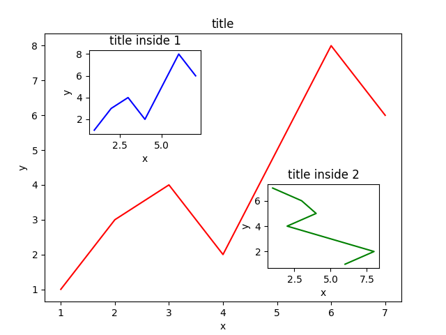
Picture in Picture
Similar to the normal plot. Just specify all the location infomation.
fig = plt.figure()
x = [1, 2, 3, 4, 5, 6, 7]
y = [1, 3, 4, 2, 5, 8, 6]

left, bottom, width, height = 0.1, 0.1, 0.8, 0.8    # how big (percentage) in the canvas (figure) (start from left bottom)
ax1 = fig.add_axes([left, bottom, width, height])
ax1.plot(x, y, 'r')
ax1.set_xlabel('x')
ax1.set_ylabel('y')
ax1.set_title('title')

left, bottom, width, height = 0.2, 0.6, 0.25, 0.25
ax2 = fig.add_axes([left, bottom, width, height])
ax2.plot(x, y, 'b')
ax2.set_xlabel('x')
ax2.set_ylabel('y')
ax2.set_title('title inside 1')

plt.axes([.6, .2, .25, .25])
plt.plot(y[::-1], x, 'g')
plt.xlabel('x')
plt.ylabel('y')
plt.title('title inside 2')


plt.show()
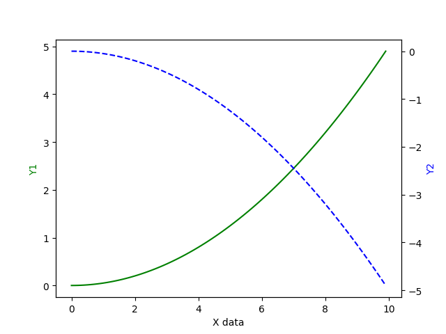
Sub Coordinate
- Main command:
ax2 = ax1.twinxto mirror the y axis
x = np.arange(0, 10, 0.1)
y1 = 0.05 * x**2
y2 = -1 * y1

fig, ax1 = plt.subplots()
ax2 = ax1.twinx()   # mirror the y-axis (share x-axis)
ax1.plot(x, y1, 'g-')
ax2.plot(x, y2, 'b--')
ax1.set_xlabel('X data')
ax1.set_ylabel('Y1', color = 'g')
ax2.set_ylabel('Y2', color = 'b')
Animation
-
Lib.:
from matplotlib import animation -
Main command:
ani = animation.FuncAnimation(fig = fig, func = anime, frames = 100, init_func = init, interval = 20, blit=False)-
func=anime: define the change function for every framedef anime(i): line.set_ydata(np.sin(x+i/10)) # update y data in the function return line, # the first of the list (line,) -
frames=100: 100 frames -
init_func=init: Initial functiondef init(): line.set_ydata(np.sin(x)) # set init. value return line, -
interval=20: frame playback interval = 20 ms -
blit=True: Update all points in the graph (False) or not (update the points changed) (True) (Usually= Falseto avoid bugs)
-
import numpy as np
from matplotlib import pyplot as plt
from matplotlib import animation
fig, ax = plt.subplots()
x = np.arange(0, 2*np.pi, 0.01)
line, = ax.plot(x, np.sin(x)) # x, y=sin(x)
def anime(i):
line.set_ydata(np.sin(x+i/10)) # update y data in the function for every x
return line, # the first of the list (line,)
def init():
    line.set_ydata(np.sin(x))   # set init. value
    return line,
ani = animation.FuncAnimation(fig = fig, func = anime, frames = 100, init_func = init, interval = 20, blit=False)
plt.show()